ok, so here is my draft
Name: name of potion
Alchemy apparatus: moved at top of screen because in theory it's the first thing alchemy guy looks at
ingredients list: multi-row, displays a lot at once. Effects in tooltips. Clicking on any ingredient selects it and ingredient appears in current ingredients
Current ingredients: name of ingredient, large icons of magic effects (with name tooltips), maybe also ingredient icon. When two effects can be used to create potion icons can be highlighted (unless you prefer separate box with that stuff). In future this box should store also saved recipes.
ok: creates potion, shift+click to create as many as you can
cancel: get me out of here!
save: in future we should be able to also save recipes
http://wstaw.org/m/2012/05/23/0012.png
Danger! it's ugly!
Alchemy screen Mark III
Re: Alchemy screen Mark III
I think this one is better.
http://dl.dropbox.com/u/22081676/Alchemy%20Menu.jpg
A different layout could have the saved recipes switched with the create potion button.
http://dl.dropbox.com/u/22081676/Alchemy%20Menu.jpg
A different layout could have the saved recipes switched with the create potion button.
-
sirherrbatka

- Posts: 2159
- Joined: 07 Aug 2011, 17:21
Re: Alchemy screen Mark III
I would put effects list somewhere else (I had no idea where to place it so I figured out highlighting). Also saved recipes should not have it's own box or at least should stick above available ingredients. I would also prefer to place used ingredients on left, not on right.
This proposal feels very chaotic IMHO.
This proposal feels very chaotic IMHO.
Re: Alchemy screen Mark III
IMO Tarius' layout would be better with "Saved Recipes" and "Effects list" boxes swapped.
Re: Alchemy screen Mark III
The reason I it the way I did was:
-The available ingreds needs to be right next to the used ingred. This sort of thing is done in countless software where you have whats available to the left and what you added to the right. This is where things start out.
-The name and the apparatus should go at the top because it should be more prominent, this is the same as the effects. The effects are important and so should be at the top.(there is a reason that the name does go at the very bottom, take when you are typing a post, the name is like a title)
-With the saved potions recipes, these are likely to be less prominant. Hence why I stuck them at the bottom.
-The buttons go at the very bottom because thats where they have been placed in countless programs and where most people would look for them.(again, look at when typing a post)
- The box sizes fit together in a pleasing manner. Perhaps its just me, but I like everything to be lined nicely as it is easier to read that way. The largest boxes should be the ingred boxes, followed by the effects box.
Alright, heres an alternate with effects switched:
http://dl.dropbox.com/u/22081676/Alchem ... %20alt.jpg
Here is one I would prefer over my original:
http://dl.dropbox.com/u/22081676/Alchem ... 20alt2.jpg
Saved recipes are at the bottom and have been switched with the potion creation button.
-This groups all teh buttons together.
-The active and available ingreds boxes are now the same size.
I think I may like this one the best of all:
http://dl.dropbox.com/u/22081676/Alchem ... 20alt3.jpg
-recipes is now under available ingreds.
-the effects are right above the create potion button. they now seem more closely linked and easier to read.
-I think it goes more nicely together. seems to flow better.

Re: Alchemy screen Mark III
This is an idea I had when we were using the old forums:
Greendogo wrote: I think we can make the potion creation process less strenuous by having an effect filter. You have a four column box somewhere on the potion screen that has all the effects that you can see from your ingredients and your alchemy level* in the second column.
*effects you see are limited by your alchemy level
At the top of the second column are a right and left arrow. The left column contains effects you want to filter in and the right is the effects you want to definitely exclude.
Now, for most potions it would be simple enough to just find restore health and include it and you would be good to go provided you have two different ingredients with the effect. However, if two of your ingredients have restore health and they both have drain fatigue you'll have a negative effect. But you have a third ingredient that has restore health and does NOT have drain fatigue. Well, now you have a simple way to add one with fatigue drain and the other one without, thus eliminating the negative effect from your potion easily without searching through a hundred different ingredients.
On the other hand, if you want to use only three ingredients, but want three different effects, you can easily search through all of your ingredients to find each ingredient that each has two of the three effects. For example, ingredient one has A and B, ingred 2 has B and C, and ingred 3 has effects C and A. You could always do this in vanilla Morrowind, but now it would be a lot easier.
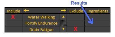
Here is a visual illustration of how this effects box would look:
*Note: I didn't include a resulting ingredient because I don't know of an ingredient off the top of my head that would satisfy the requirements.
Here, the effect for "Water Walking" is included and the effect for "Drain Fatigue" is excluded. Only the ingredients that fit that description would show up in the "Ingredients" column, which is just a fancy way of saying "Search Results". There is one thing that I didn't mention above: If you Include/Exclude an effect, only effects that are on items that satisfy the previous Include/Exclude requirements would show up. This way you know right away what other effects you're dealing with when picking out multi-effect ingredients.
Re: Alchemy screen Mark III
IMHO, this would somewhat kill the role-play factor (MW is an RPG after all, not a MySQL front-end). It would be easy to use though, so perhaps this could be a good post-1.0 .esx mod.Greendogo wrote:This is an idea I had when we were using the old forums:
Greendogo wrote:...
Re: Alchemy screen Mark III
PostgreSQL at least... 
-
sirherrbatka
- Posts: 2159
- Joined: 07 Aug 2011, 17:21
Re: Alchemy screen Mark III
Imho saved recipes should be above current mix (since it's basically recipe, saved or not). Name should be near create button since naming potion is the last thing you do before creating it.
Overall I didn't like the first sketch, the last one is mostly ok but I prefer my draft more.
Overall I didn't like the first sketch, the last one is mostly ok but I prefer my draft more.
Re: Alchemy screen Mark III
Heres an idea, either make it customizable, or have a poll.sirherrbatka wrote:Imho saved recipes should be above current mix (since it's basically recipe, saved or not). Name should be near create button since naming potion is the last thing you do before creating it.
Overall I didn't like the first sketch, the last one is mostly ok but I prefer my draft more.